
Monday, July 29, 2013
Atlas Detector
I've previously noted Dr. Sascha Hehlhase's LEGO rendition of the Atlas detector, used in the search for the Higgs boson. He's gone on and made a Cuusoo project of the Atlas detector, which subsequently received 10,000 votes. I seriously doubt this will become an official LEGO set, but it would be cool if kids all over were asking their parents to buy them a LEGO Atlas detector.


Saturday, July 27, 2013
Rotational symmetry
School kids at Dryden Elementary had a great lesson on rotational symmetry, creating mosaics with C4 axes. Via MosaicBricks.


Friday, July 26, 2013
Symmetry - Axis of Proper Rotation
Okay, back to symmetry, an axis of proper rotation (often just called a rotation axis, or a Cn axis) is a symmetry element found when you rotate an object by some fraction of 360 degrees and the result looks identical. E.g. if you rotated an equilateral triangle by 120 degrees, you would see the exact same triangle. This is called a C3 axis, since you are rotating by 1/3 of 360. Since LEGO bricks are mostly squares and rectangles and fit together most easily with 90 degree angles, it is pretty common to see LEGO creations with C4 or C2 axes (of course these often require that you ignore the word LEGO written on the studs or other minor imperfections that break symmetry).
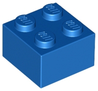

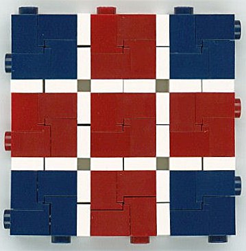
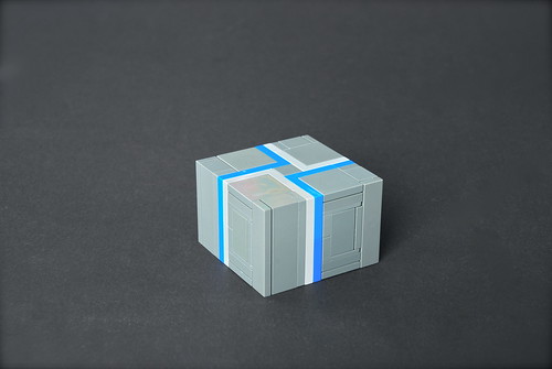
However, with some clever building, you can come up with LEGO creations with other rotational axes. These creations have C3, C5, C12 and C16 axes, respectively.
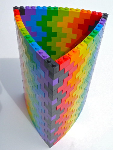

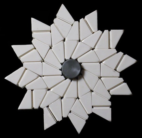
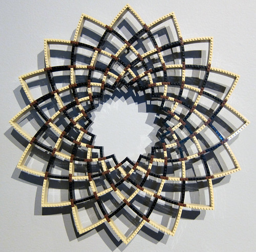


However, with some clever building, you can come up with LEGO creations with other rotational axes. These creations have C3, C5, C12 and C16 axes, respectively.


Thursday, July 25, 2013
Rosalind Franklin
I'll get back to symmetry tomorrow, but I'll do an aside today, spurred by the Google doodle in honor of what would have been Rosalind Franklin's 93rd birthday. I've peviously noted how important she was in the discovery of the structure of DNA. If she had not sadly passed away at a very young age, she surely should have been considered as part of the 1968 Nobel Prize. Last year Wendy Staples of the Quirky Cookie made a lot of science and women-scientist themed cookies for the launch party of the ScienceGrrl Calendar at the London Science Museum. ScienceGrrl is a British organization to promote science education, particularly to young girls. Anyway, here we see cookies of LEGO versions of Rosalind Franklin and Hedy Lamarr (best known for her movie career, but she also developed a radio frequency hopping technique that formed the basis for much of today's wireless technology). BTW, you really should go see all of the cookies. They're really cool, and I'm sure were perfect for a science themed event.


Wednesday, July 24, 2013
Symmetry - mirror plane
Symmetry is a very important concept that is useful in all of the sciences. There are four basic symmetry elements - axis of proper rotation, axis of improper rotation, mirror plane, and point of inversion (technically these last two are only special cases of improper rotation, so you could correctly say there are only two symmetry elements). The most readily understood element is the mirror plane, where you can cut an object in half, and every point on one side of the mirror plane reflect across to an identical point on the other side. You're surrounded by objects with bilateral symmetry - a coffee cup, for instance, or the chair you're sitting on. Even the human body has rough bilateral symmetry if you ignore details like parting your hair to one side or wearing a watch on one arm and not the other. Here are a couple of LEGO objects with mirror planes, Pete Reid's LL-497 (if you ignore the Classic-Space logo) and Luis Baixinho's Butterfly.*

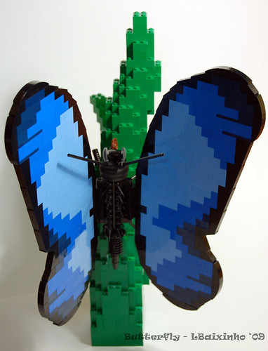
*Just to be pedantic, and before someone calls me on it, the fact that the word LEGO is written on the studs means than no LEGO object actually has bilateral symmetry, because you would have to have the mirror image word written on the other side of the creation.


*Just to be pedantic, and before someone calls me on it, the fact that the word LEGO is written on the studs means than no LEGO object actually has bilateral symmetry, because you would have to have the mirror image word written on the other side of the creation.
Monday, July 22, 2013
Friday, July 19, 2013
Working microscope
Carl Merrian built this Working microscope. It uses official LEGO elements like the magnifying glass element, technic gears, and fiber optic system to actually allow you to focus in on small objects.


Thursday, July 18, 2013
Jupiter control room
During my focus on illusions for the past couple of weeks, I've passed up some great creations, like Legodrome's Jupiter control room, which he created as a commission for the French space agency CNES.


Wednesday, July 17, 2013
Necker cubes
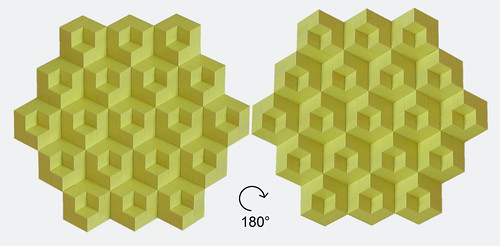
One last optical illusion for now, and then I'll go back to something else. A Necker cube is a bistable image of a cube where it is unclear which is the front face and which is the back face. Here's a more complex version built of Modulex by Brixe63. Are the small cubes pointing forward from larger cubical recesses, or are the larger cubes pointing forward with little small-cube-shaped bites taken out? Does rotating the whole thing change that perception?

Tuesday, July 16, 2013
Figure ground perception
The bistable figure featured yesterday is also called a figure ground perception illusion. The idea here is that the mind has to somehow use visual clues to decide if the white part is the foreground against a black background (which would make the image a vase), or if the black part is the foreground against a white background (two faces). When there are no obvious clues, the mind could jump back and forth between the two alternatives. Here is another version, Alex Eylar's Good and Evil. Which do you see?


Monday, July 15, 2013
Rubin's Vase
Rubin's Vase (here by 2x4) is an example of an ambiguous image, or a bistable image. That is, the visual clues could resemble one of two (or more for multistable images) different pictures. In this case you can see either a vase in white or two faces in black. Your mind will hold onto one, but could then switch to the other.


Wednesday, July 10, 2013
Contrast illusions
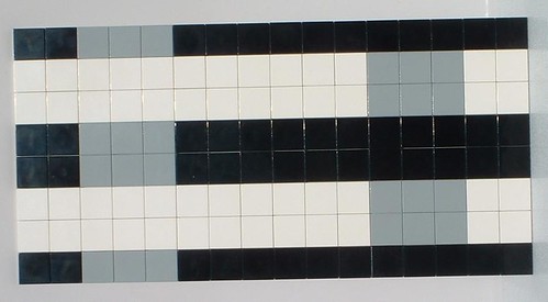
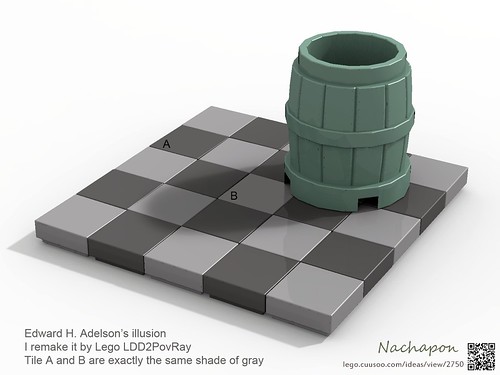
Contrast illusions are when you are tricked into thinking that some color is lighter or darker than it actually is. A simple example is demonstrated here by Arthur Gugick. Those gray squares are exactly the same color. A more complicated illusion is the checkershadow illusion invented by Edward Adelson, virtually recreated in LEGO by Nachapon. Here tiles A and B are exactly the same shade. I've seen both physical and mental explanations for these. The physical explanation lies in the way adjacent receptors in the eye enhance or inhibit each other. If a receptor is stimulated by the gray color, and the adjacent receptor is being stimulated by the white, the physical response is different from a receptor stimulated by the gray adjacent to a receptor stimulated by the black. The mental explanation is easier to explain for the second example. Since we know that objects in the shadow will appear darker, when we see that tile shadowed by the barrel, our mind simply assumes that it's actually a lighter color, and the reverse can be said about objects in direct light. So A and B seem to be different based on our assumptions of objects being in light or being in the shade.


Tuesday, July 9, 2013
Illusory motion
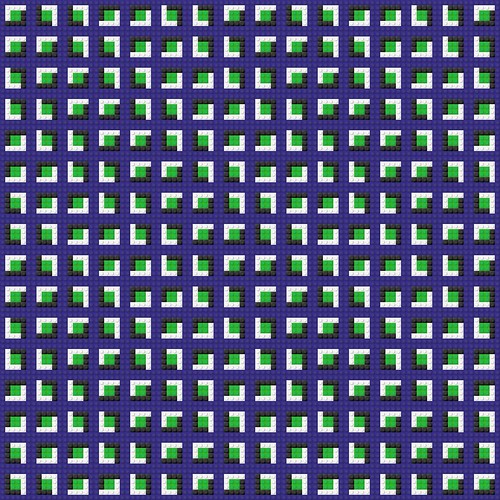
Here's an even better version of illusory motion by Sittiponder. I promise, this is a static mosaic, not some animated gif.

Monday, July 8, 2013
Hermann's Grid
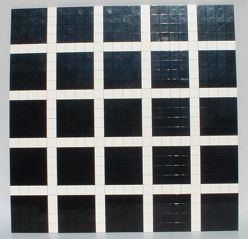
Arthur Gugick built this version of Hermann's Grid. Notice the pale gray dots that appear at the intersections, but disappear when you look directly at the intersection. This is a physical illusion, based on the excitation and inhibition of receptors in the eye. When a receptor is stimulated by a bright region, it is excited. But, if the receptors surround it are also stimulated by bright regions, this serves to inhibit the central receptor. I believe that this is done to enhance contrast, to help you see patterns in areas of similar colors - this will help you see the tiger camouflaged by the tall grass, which will give you some survival advantage. The points at the intersection are surrounded by more bright regions than other portions of the white lines, and so therefore these are somewhat dimmed by inhibition of the receptors. This effect is exaggerated in the peripheral vision, and so the gray dots disappear when you look directly at them.

Sunday, July 7, 2013
Pinched checkerboard
Andy_0306uk also built this pinched checkerboard. The explanation is the same here as the bulging checkerboard I posted a couple of days ago, but since the dots angle the other way it seems to pinch in rather than bulge out. I think the previously featured one works better because it has both black dots on the white squares and white dots on the black squares. Here the plain white squares seem to break the illusion somewhat.


Saturday, July 6, 2013
Ghost image
Our next illusion is a ghost image by Tom Remy. This one takes a little work, and doesn't always work right the first time, so you may have to try again. Stare steadily at the image for about thirty seconds, focusing on the center of the face. Then quickly turn and look at a blank white paper. You should see a classic yellow smiley for a few moments. This is an example of a negative afterimage, which is a physical illusion based on how the light receptors in the eye work. Your eye has three types of cone receptors, that perceive blue, green and red light. The relative stimulation of these receptors is interpreted by the brain to give the perception of the whole spectrum of colors. When you stare at the figure, the blue receptors are overstimulated, and adapt by losing sensitivity. When you shift your vision to the white paper, the blue receptors are slower to respond than the red and green receptors, and so your brain receives stronger signals from those two types, which is interpreted as the negative of blue, or yellow. If the illusion didn't work for you it's probably because you didn't hold your eyes steady enough, as your body normally compensates for this receptor overload by flitting the eyes back and forth.


Friday, July 5, 2013
Bulging Checkerboard
Andy0306uk built this great bulging checkerboard, an illusion first created by Akiyoshi Kitaoka. The explanation lies in how our mind tries to make straight lines out of the patterns of small dots that alternate back and forth around the lines that are actually straight. BTW, Arthur Gugick and Tom Remy have also built versions of this illusion.


Thursday, July 4, 2013
Cafe Wall
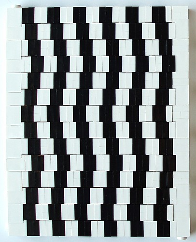
Our next illusion is the Cafe Wall, here in LEGO by Katie Walker. In 1973, Steve Simpson, a student working with psychologist Richard Gregory, was eating lunch and noticed that the black and white bricks in the wall appeared to follow curving lines, but when you looked close you could see they were straight. One explanation for this geometrical-optical illusion is based on physical differences in how the receptors in the retina perceive the black and white area. The thought is that the black areas bleed over and stimulate the nearby receptors that should be seeing the white area. And so instead of looking square, the black shapes seem to flare out a little as trapezoids. Since the mind sees that these all come together in a pattern, it tries to fit trapezoids together, which leads to the perception of lines sloping this way and that. But they're straight, really. If you don't believe me, hold a piece of paper up to your screen and you can see that every edge is parallel.

Wednesday, July 3, 2013
Optical illusions
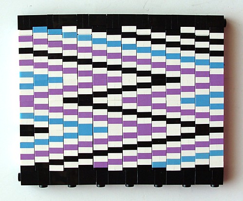
Optical illusions occur when we think we see something that isn't really there, or in some other way our perception doesn't exactly match up with the actual visual stimuli. I've done a little reading to learn more about these, and it seems that there are two different reasons for these illusions - physical and mental. By physical I mean that there is something about how the nerves are stimulated in the eye, or how they interact in the brain, that gives rise to the illusion. Mental illusions are when our perception (and I'm NOT going to try to dig into the whole mind/brain discussion* here) makes mistakes when it to fit conflicting or incomplete visual inputs into some recognizable pattern. There have been a lot of LEGO renditions of optical illusions, so I'm going to do a small series. I'll start out with the one that inspired this series. A couple of days ago Katie Walker posted this zig zag. I noticed that if you stare at it, the lines appear to be wiggling back and forth. This is a form of illusory motion. There seem to be conflicting views on why these work, but in general they overstimulate our eyes with repetitive patterns of colors and light and dark. They also are related to fixation jitter - our eyes don't sit still, but actually move around. I think that the differences between the way we perceive objects at the center of our visual field vs objects in our peripheral vision are also very important to these illusions, as with most of them the area at the center of focus is sitting still, but it's the areas just to the side that are moving (but when you shift your focus those areas sit still and the other starts moving).
* Okay, just a little bit in case anyone wants clarification. The mind/brain discussion is the question of whether your consciousness/self/mind is, at one extreme, simply a series of chemical interactions in the brain, or, at the other extreme, a nonphysical identity (a soul) that somehow interacts with the brain. Or is it somewhere in between. That's a deep subject that would involve neuroscience and philosophy and religion.

* Okay, just a little bit in case anyone wants clarification. The mind/brain discussion is the question of whether your consciousness/self/mind is, at one extreme, simply a series of chemical interactions in the brain, or, at the other extreme, a nonphysical identity (a soul) that somehow interacts with the brain. Or is it somewhere in between. That's a deep subject that would involve neuroscience and philosophy and religion.
Subscribe to:
Comments (Atom)
